Maps are great. Maps show the lay of the land and how it changes- how the setting changes and why the story and characters are prompted directly or indirectly to change with it. The latter is what gets me invested in history, the stories and experiences that is. So, what happens when the stories and experiences aren’t recorded and documented with utmost clarity? Keller and Baldwin show that we, the audience, take sides.
Did the chicken or the egg come first? And does it matter? The debate on if the symbol on the ground is a 6 or 9 shows it does matter. But when I was looking up the memorable illustration that puts emphasis on perspective, I found another edited version of it. And I think this added commentary provides a more insightful point to this blog post on the truth and finding it.
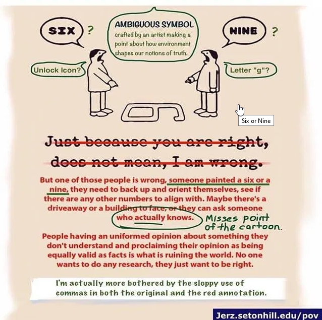
“[The] environment shapes our notions of truth.”
– Jerz.sentonhill.edu/pov
For Keller, the environment is that the cannonballs were placed by Fenton ON the road for dramatic effect. And the notion of truth is that his character is suffering.
In comparison, Baldwin sees the environment as shifting without Fenton’s interference- and his character is not suffering.
Both notions are just that, though, beliefs- fantastical in the intuitive analyses that was done. However, the notions are still believable, because the analyses were conducted with human intuition. This makes them easy for us to follow. But they both used a bias in favor of or against Fenton to offer context and provide emotion. In that, they projected their own feelings (“the stuff that is in [their] heads” -pt1) conjured by Fenton onto his photography.
And while tempting, this is the wrong way to conduct analysis.
The right way to conduct analysis is through data and research- concrete facts and observations. It can be a time-consuming process without intention or awareness, especially with visualization software and persnickety details. When Chris Russ said:
“I’m going to have to balance these pictures to match each other. Let me play for a few minutes, I’ll be right back with you,”
– and finished a couple hours later, I felt that. Every proclaimed visual perfectionist felt that.
But that’s not the point. The point is that outlying, frustratingly minuscule details can offer more context than “the big picture” and the primary grouping(s) of data within the statistical definition of “normal.” And in my opinion, the best chance we have in order to catch onto these details is through visual means. This is because it’s easier to spot an outlying data point when it’s plotted in a visualization, compared to a data point in a line-up of thousands of other data points.
In this scenario, the outlying pieces of data are the ancillary rocks. These proved that the cannonballs were moved from OFF the road to ON the road. “Rocks that no one cared about. Those little guys that got kicked aside.” (-pt3)
My professors teach me to mostly ignore outliers, they “mess up” otherwise perfect data. But here’s a scenario where they can save the data and preserve the context.
4 replies on “On Visualization and Outliers”
Thank you for writing this post! Prior to reading these articles and your observations, I hadn’t thought about the use (and misuse) of outliers in data compilation. An outlier might just be an unimportant aberration that doesn’t impact the study, however, it could also reveal vital information. It is the responsibility of the person or group conducting the study to discern whether there is anything to be learned from the outliers and to use that knowledge to better their research. If your professors are teaching their students to only ignore the outliers, that is too bad. I’m sure that their students’ research is weaker for it.
Definitely some food for thought here! As a historian, I have always been a little weary of graphs or maps of a mathematical nature: “I do history, not math,” type of mindset. However, you make a really important point in terms of how these visualizations can make outliers or trends stand out. I can read dozens of primary sources and take detailed notes in bullet lists, but if I don’t take time to interpret these notes, I can miss vital information. Perhaps it is time for this historian to branch out!
I agree that outliers can be important when looking at data related to history. They can send you in a direction where you fine new and interesting information that adds to the narrative that you are studying.
I like the image that accompanied your post. Including the image proves that while an image may have one meaning for the person who created it, it may come to have other meanings for other people, or society as a whole.