Categories
Data/Visualizing the Past

Maps, Graphs, Images, and Other Ways to Visualize the Past (Session 6)

This week, participants in HIS 5595 explored how historians use data and visuals to make sense of their research. Each table received visual explanations and participants discussed the relationships established by the data, which data is displayed (and which is absent), and the purpose and intended audience(s).

The first graphic – Minard’s 1869 map of Napoleon and his army’s march through Russia – provided an array of helpful information. The build-up to the Franco-Prussian War meant that Minard created this map as a warning for French audiences in 1869 to remember the follies of imperialistic ambitions. The graph packs a lot of data, which shows casualties in relation to temperatures, time, space, and geographic locations of importance.

The second image – Reebee Garofalo’s The Genealogy of Pop/Rock Music – is a somewhat subjective measurement of how earlier genres could birth new forms of rock music. As fascinating as these relationships seem to the casual viewer, participants largely agreed that that Garofalo’s use of record sales was not as well documented. Also, the diffusion of music is not very well explored, such as the effects of transistor radios, along with the home audio system becoming economical enough for the middle and lower classes. All of this leads to more sales, yet these technological advancement were not measured by the graph. That being said, her work is a fascinating look at how trends in music birth new sounds and styles.

The rest of the session dealt with a variety of graphics and images, including: an illustration that explains “Why the Potomac River Is So Dangerous,” which provided an excellent explanation of the dangers of navigating the Potomac (even to the point where text could be removed and still reach multiple cultures and languages with ease), another illustration that teaches viewers how to spot hidden handguns (presented by a former law enforcement officer ), and a historical graph that provides a beautiful representation of world empires and their offspring.

We also explored various mapping models (Mercator, Gall-Peters, etc.) and their inherent biases, GIF images that chart the history of slavery to the Americas and the loss of territories of indigenous peoples in North Americas, as well as the website Renewing Inequality, with a variety of visualizations detailing income inequality in the United States. This last website – Renewing Inequality: Family Displacement through Urban Renewal, 1950-66 – allows viewers to explore how people were displaced based on skin color, poverty, location, and type of displacement. It is an immersive experience, one matched by the website Foreign-Born Population: A Nation of Overlapping Diaspora, which allows users to explore immigration to the United States by county. It provides the number of immigrants and their country of origin.

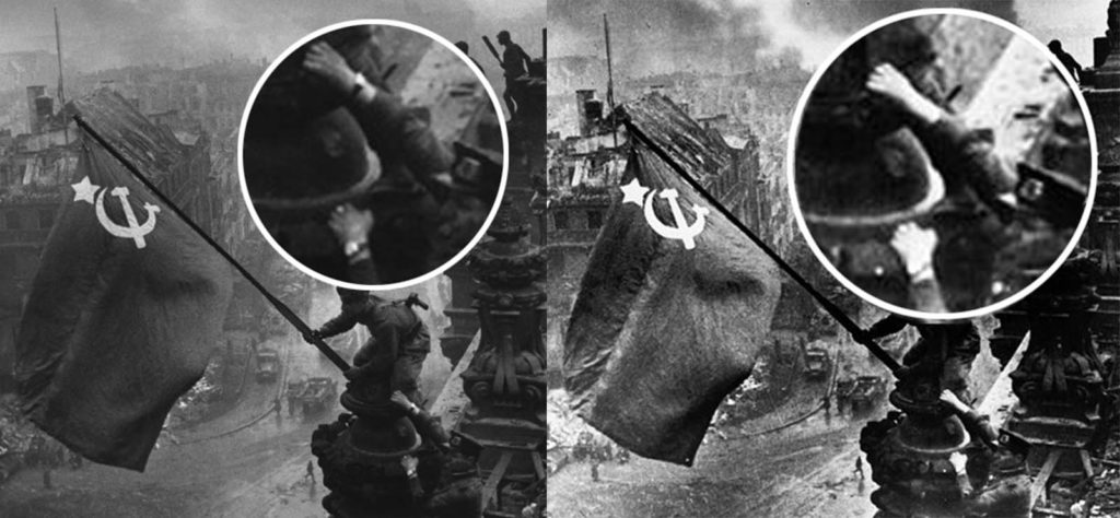
Session 6 ended with some levity, of sorts, by looking at how Google Maps sparked a political conflict between Costa Rica and Nicaragua, the London Underground map (and how the metro lines actually run on a physical map of the city), and filmmaker Errol Morris’ in-depth analysis of photo manipulation by Roger Fenton during the Crimean War in his photograph “Valley of the Shadow of Death.”

-Josh, Jeff, Kaitlyn, and Lydia

Categories
Data/Visualizing the Past

Photo Manipulation as Zeitgeist

This week’s readings deal with the issues surrounding imagery, including source manipulation and the resulting interpretations.  However, these issues are not exclusive to history: this is a digital issue, period.  Image manipulation is a problem that will come with access to Photoshop.  However, with that also comes better cultural awareness of the practice.  We can notice that, regardless of the bias of the presenter, there is plenty of awareness of fake news and narrative in today’s social discourse.  Only which ‘side’ is fake is the subject of debate anymore.  So history, and humanities in general, is only being affected by a larger societal problem.  What we should be grateful for is that academics SHOULD be in position to better recognize when it’s happening. 

However, it does also bring up the question of how far we should go to institutionalize targeted education at recognizing source manipulation.  Should we have entire classes based around recognizing Photoshop in history departments?  Tools continually get better, and photo manipulations in particular are getting almost indistinguishable to ‘real’ photos.  And that’s the value of Morris’ article: it shows that photos in themselves are not always enough to count as irrefutable evidence: we still need the written sources.  It shows that on some level, history will remain a discipline of textual analysis.  No matter what other changes come to the field, there’s still a core set of skills and methods which will make history a professional discipline.

Categories
Data/Visualizing the Past

History or His Story

This week’s readings were quite interesting to me, as they seemed to portray a common theme that I have noticed within history: perspective (or opinion). Often times, historians seem to make trivial conclusions regarding spotty details, which can be seen in the reading that concerning the 2 photographs in the Valley of the Shadow of Death. These types of trivial conclusions are not always even important (depending on who you ask) to set the scene for the historical event. For example, in reality, how does the landscape of this battlefield really impact or inform one’s thinking of the picture? I’m not claiming that whether the cannons were moved doesn’t matter, however, it isn’t pivotal for most people. The website containing the collections of maps is something that most would find to be more accurate, which it possibly is, but it is only as accurate as the technology used to gather the information. Remember, at one point, philosophers thought that the Earth was flat and to sail towards the unknown would make you fall off the face of the planet. Maps can however, tell a story about location. Though the land doesn’t physically go anywhere, invisible lines/boundaries/roads can always change and affect the way the tract of land is perceived.

The personal connection that I have made with this reading is regarding my views about white-washed history but also regarding my hobby as a genealogist. Often times, the narrative that we assume to be correct is only due to the viewpoint of the individual(s) telling it. For example, how many times have we thought that the famous 50s hit, Hound Dog, which is associated with Elvis Presley, but in reality, it was a hit stolen from Big Mama Thornton. Even within my genealogy research, there was prominent story passed down through the generations regarding an ancestor being the first Black man to own land after slavery. Well, there were things about that story that were correct, but some such as my ancestor being sold that was a little shakey. (Finding the RIGHT Tom Taylor, shameless plug: YoungBlackGenie). I say all of that to say that it is imperative that we are critical of facts in an effort to ensure that we are telling and interpreting history not making it his story.

Categories
Data/Visualizing the Past

Mapping History

You may read the: Which came first, the Chicken or th Egg article, and think: ‘what does it matter?’ – I certainly did.

In the end, it was impressive how Morris came up (with hopefully) a final answer to which photo was taken first. You have to admire his perseverance. While I might still not get the full point of why it really does matter, it does show a great example of how to do historical research in a different way, using technology.

The other sources for this week, are also great examples of how to do historical research in a different way. Especially with Georeferencer it is very easy to use and you can tell your story in a more engaging way. It will be especially useful for immigration studies, because you can just with one click , show your audience the immigration routes relevant to your research.

Furthermore, I think making maps using GIS or arcGIS is very relevant for the history field. A friend of mine, is studying Urban History and she can show me with one map how the Jewish population changed over time in Amsterdam, using these programs. You can color-coordinate it, with dark red being a lot of Jews, and the more orange/yellow the color, the fewer Jews. This also speaks more to your imagination, than to just read numbers and percentages.

The only doubt I have about using mapping and software in the history field is, that it is not very common. At least in the Universities in the Netherlands they do not use it, nor do they teach it. (With the exception of Urban History). And I am not sure if this is going to change soon, and if teachers and students are willing to change the history field.

Categories
Data/Visualizing the Past

“Nothing is so obvious that it’s obvious”

As historians, we are taught to utilize primary sources. In fact, our work is only possible through accounts, whether written or visual, of past events. However, our whole field of work becomes unhinged if the very primary sources we study are doctored. I don’t just mean relying on a diary that has a biased perspective, but basing historical work on a source that is fabricated or changed to create a different meaning. This becomes particularly disheartening when photos, the seemingly most truthful depiction of history, is the product of political objective.

Some photographs have now been identified and discredited for their edits. Yevgeny Khaldei’s “Raising a Flag Over the Reichstag” taken in May 1945, seems to capture the triumphant moment Soviet forces freed Eastern Europe from the grips of Nazi control in the capital city of Berlin. Much like Joe Rosenthal’s photo of soldiers raising an American flag over Iwo Jima, Khaldei’s photo depicted the moment good seemingly won over evil. Perhaps this is due to some crucial edits and staging of the photo. Though Khaldei took great care to make a Soviet flag big enough to recreate the patriotism of Rosenthal’s photo, he failed to realize that one of the soldiers in the picture was wearing a watch on each wrist – physical proof of the rampant looting Soviet troops committed in military occupations. Soviet censors order him to remove one of the watches before it was to be printed in major newspapers. Only with the confession of Khaldei, vast knowledge of the propaganda strategies of the Soviet regime, and original prints can historians definitively mark this photo as evidence of the corporation in the Soviet Union’s totalitarian regime.

One the left, the original photo Khaldei took in May of 1945. The right image is after taking out the watch as well as adding more shadows and smoke in the background. Photo from https://rarehistoricalphotos.com/soviet-flag-reichstag-berlin-1945/

However, is this photo really just the product of totalitarianism? Quick to prove political intentions, we can forget the photographer himself. Nazi forces killed most of Khaldei’s family and he witnessed the atrocities German forces committed in Eastern Europe throughout his own life. So while Khaldei had government orders to doctor the photo, he had his own reason to make the Soviets look like heroes over the evil of Germany. In fact, he would deflect questions about the photo with answers like “it is a good photograph and historically significant. Next question please.” Both groups wished to elevate the Soviet image, but different reasons.

So, does it matter that the historical record gets the right intention? Filmmaker Errol Morris thinks so. In his New York Times article covering his efforts to discover which photo of “The Valley of the Shadow of Death” came first by Roger Fenton, he criticizes the psychological analysis experts revert to in order to prove that Fenton initially moved cannonballs onto the road to create more dramatic image. Many cited that it was “obvious” Fenton moved the cannonballs back on the road for a better shot. Even though Morris was wrong and the cannonballs on the road was in fact the second picture, the intention was not as obvious as others believed.

Therefore, sharing data and visualizations of the past cannot fall victim to the human tendency to go with the obvious explanation. What seems obvious to us now would not seem obvious to actors of the past – and vice versa. We as historians must provide the tools and insight in order to overcome our own biases through lived experience. Programs like Georeferencer v4 let people compare modern understandings of the world around us versus the understandings of those before us. Looking at a current map over top a historical map from the 16th century could enhance our interpretation of Early Modern navigation and worldview. Tools like this will allow us to view visualizations of the past in their own time, rather than creating a historical narrative based on what we perceive to be obvious.

An example of the Georeferencer/Compare tool using a historic map of the western United States. Photo courtesy of https://www.davidrumsey.com/view/georeferencer

Viewing visual primary sources in their own time does not mean we have to adopt the prejudice or ignorance of a previous society. Rather, it means in order to gauge the most truthful depiction of the past, how society was perceived in its own time, we must set aside what we assume is obvious to what those before us were just experiencing.

Categories
Data/Visualizing the Past

On Visualization and Outliers

Maps are great. Maps show the lay of the land and how it changes- how the setting changes and why the story and characters are prompted directly or indirectly to change with it. The latter is what gets me invested in history, the stories and experiences that is. So, what happens when the stories and experiences aren’t recorded and documented with utmost clarity? Keller and Baldwin show that we, the audience, take sides.

Did the chicken or the egg come first? And does it matter? The debate on if the symbol on the ground is a 6 or 9 shows it does matter. But when I was looking up the memorable illustration that puts emphasis on perspective, I found another edited version of it. And I think this added commentary provides a more insightful point to this blog post on the truth and finding it.

“[The] environment shapes our notions of truth.”

– Jerz.sentonhill.edu/pov

For Keller, the environment is that the cannonballs were placed by Fenton ON the road for dramatic effect. And the notion of truth is that his character is suffering.

 In comparison, Baldwin sees the environment as shifting without Fenton’s interference- and his character is not suffering.

Both notions are just that, though, beliefs- fantastical in the intuitive analyses that was done. However, the notions are still believable, because the analyses were conducted with human intuition. This makes them easy for us to follow. But they both used a bias in favor of or against Fenton to offer context and provide emotion. In that, they projected their own feelings (“the stuff that is in [their] heads” -pt1) conjured by Fenton onto his photography.

And while tempting, this is the wrong way to conduct analysis.

The right way to conduct analysis is through data and research- concrete facts and observations. It can be a time-consuming process without intention or awareness, especially with visualization software and persnickety details. When Chris Russ said:

“I’m going to have to balance these pictures to match each other. Let me play for a few minutes, I’ll be right back with you,”

– and finished a couple hours later, I felt that. Every proclaimed visual perfectionist felt that.

But that’s not the point. The point is that outlying, frustratingly minuscule details can offer more context than “the big picture” and the primary grouping(s) of data within the statistical definition of “normal.” And in my opinion, the best chance we have in order to catch onto these details is through visual means. This is because it’s easier to spot an outlying data point when it’s plotted in a visualization, compared to a data point in a line-up of thousands of other data points.

In this scenario, the outlying pieces of data are the ancillary rocks. These proved that the cannonballs were moved from OFF the road to ON the road. “Rocks that no one cared about. Those little guys that got kicked aside.” (-pt3)

My professors teach me to mostly ignore outliers, they “mess up” otherwise perfect data. But here’s a scenario where they can save the data and preserve the context.

Today I learned: Outliers can provide the perspective that we need to properly analyze data.

css.php